728x90
layout1.html
<!DOCTYPE html>
<html lang="ko">
<head>
<meta charset="UTF-8">
<title>Document</title>
<style>
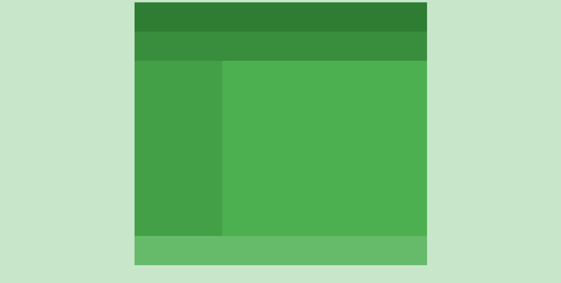
body {background: #c8e6c9;}
#wrap {width: 1000px; height: 900px; margin: 0 auto;}
header {width: 1000px; height: 100px; background: #2e7d32;}
nav {width: 1000px; height: 100px; background: #388e3c; } /*<nav>태그 : 내부 페이지 및 외부 페이지에 대한 탐색 링크를 제공하는 페이지 섹션을 설정*/
aside {float: left; width: 300px; height: 600px; background: #43a047;} /*<aside>태그 : 주요 콘텐츠의 보조적 컨텐츠 섹션을 설정*/
section {float: left; width: 700px; height: 600px; background: #4caf50;} /*<section>태그 : 주제별 그룹의 콘텐츠 섹션을 정의*/
footer {float: left; width: 1000px; height: 100px; background: #66bb6a;}
</style>
</head>
<body>
<div id="wrap">
<header></header>
<nav></nav>
<aside></aside>
<section></section>
<footer></footer>
</div>
</body>
</html>더보기
참고 유튜브 :
https://www.youtube.com/watch?v=52TT7SLexxE&list=PL4UVBBIc6giL7ygRa-P7UExEKqZgx4t9K&index=1
728x90
'프론트엔드 > 반응형 사이트 만들기' 카테고리의 다른 글
| 반응형 사이트 - 반응형 레이아웃 유형1 (0) | 2021.11.25 |
|---|---|
| 반응형 사이트 - 미디어 쿼리 (0) | 2021.11.25 |